Комментарий #9735687


в профиле пользователя animeshnik_ALT
Более компактное отображение постеров на страницах списков
код
За формулу спасибо /grin3671
скрины 1188x824
 359x402
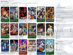 1200x904
 358x395
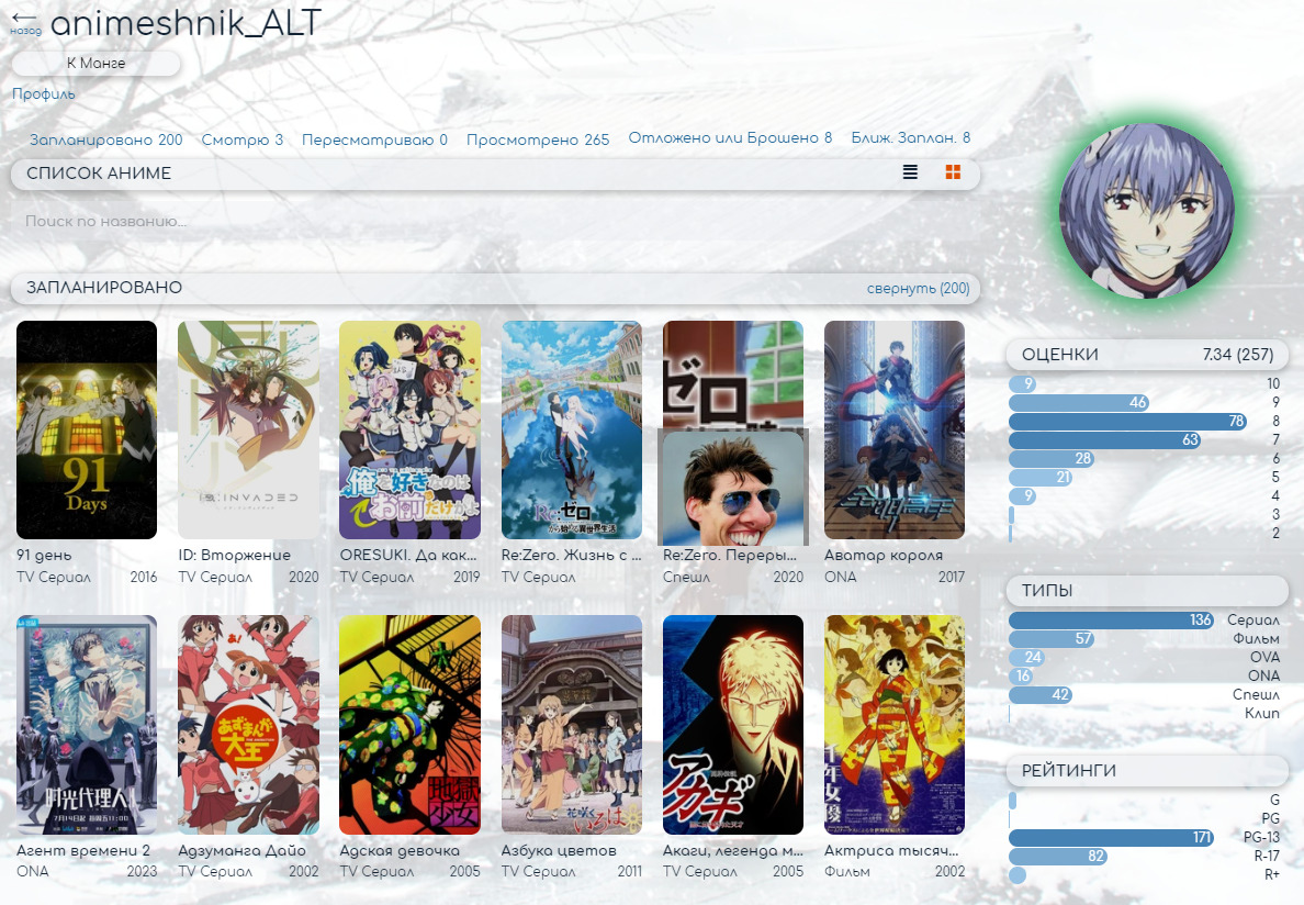 1188x824
 359x402
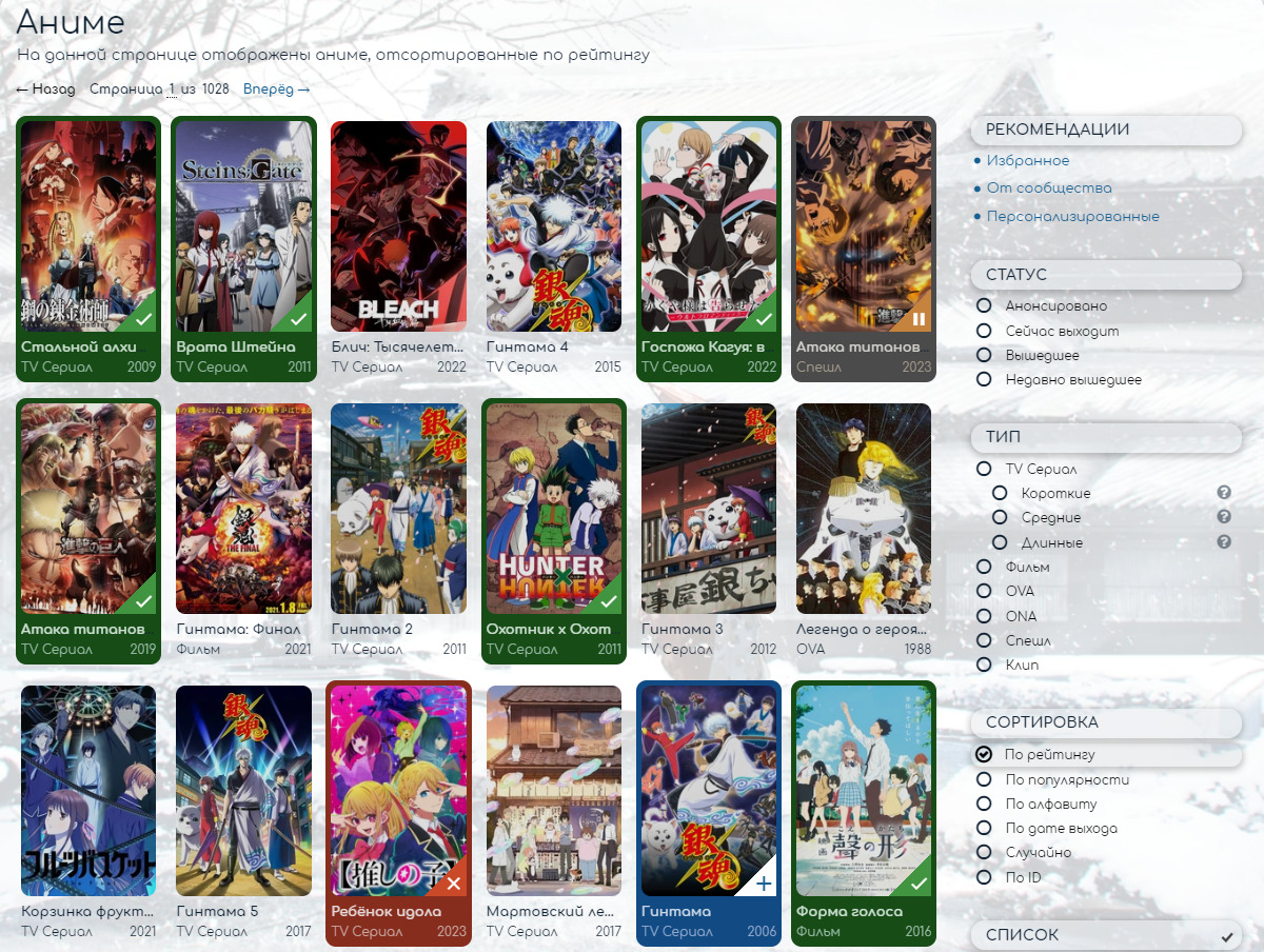 1200x904
 358x395
Ответы
Нет комментариев
Твой комментарий